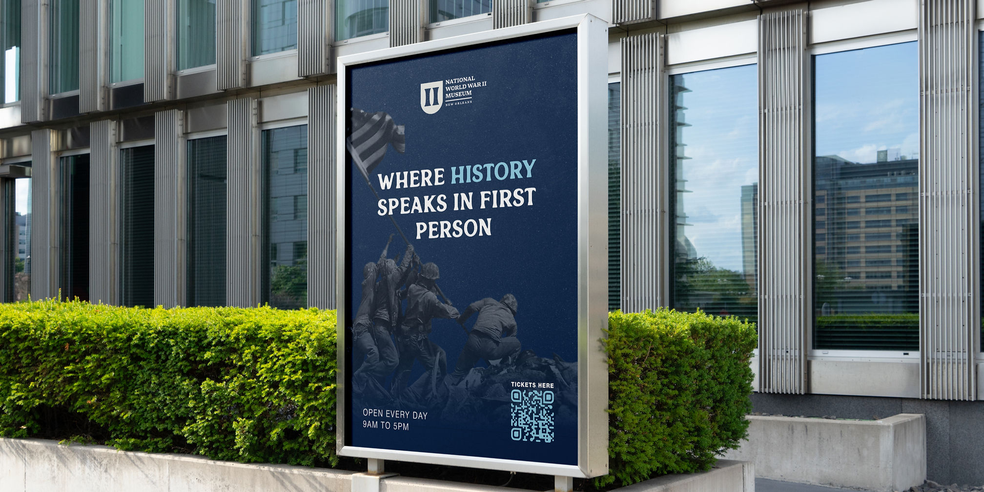
A RE-DESIGN FOR
MY FAVORITE MUSEUM
The National WWII Museum is my favorite museum in the country, but the original branding felt bland and out dated. A museum of this quality deserves a visually appealing identity. The WWII Museum of New Orleans is a living archive of American history, memory, and first hand human experiences. The challenge with this redesign was honoring the weight of that legacy while modernizing how the story is visually told. The goal was not to make the museum feel trend-driven, but to make it feel intentional, clear, and emotionally resonant for a contemporary audience.
The existing visual system communicated information effectively, but lacked the warmth that a museum should have across digital and promotional touchpoints. This redesign focused on clarity, simplifying, and respect for the subject matter. Typography, layout, and visual hierarchy were refined to feel timeless rather than ornamental, allowing the stories, artifacts, and voices of history to lead, while the design quietly supports them.


A SYMBOL OF STRENGTH
AND SERVICE
The logo redesign centers on a shield form, drawing subtle inspiration from military insignia and service badges. It’s a deliberate departure from decorative nostalgia, instead embracing strength, structure, and permanence. The shield establishes an immediate sense of authority and protection, values deeply tied to the museum’s mission and the history it preserves.
At the core of the mark, two bold vertical “i” forms stand in symmetry like traditional military insignia. The result is a mark that feels confident and institutional without being rigid, modern in execution, but grounded in purpose. Rather than referencing the past literally, the logo communicates it emotionally, positioning The National WWII Museum as both a guardian of history and a powerful presence in the present.


